Thursday, April 30, 2015

Tracking The Money Flows

We ended Tuesday's post with a look at the dollar's April weakness and posed the thought that this might spur money to flow back into Large Cap multinationals.  And after surveying the most recent data, it appears this is indeed happening.

On a year to date basis, investors have sold out of U.S. Large Cap stocks en masse.  As of yesterday, more than $40 billion had left the asset class since December 31st (most of that coming out of the SPY ETF).  This made a fair amount of sense as Small and Mid Cap stocks had reasserted themselves in the year's first 3 and a half months and handily outperformed Large Caps.  Part of this should be attributed to mean reversion as Large Caps crushed Mid and Small last year but we see the dollar's moves as the major contributor.

However, over the last week we've seen these sentiments unwind a bit and money flows favoring Large Caps.  According to Convergex, Large Caps have brought in nearly $2 billion while Small Cap funds have lost more than $400 million.  It certainly appears that the dollar's recent decline has prompted investors to reallocate back into the Large Caps as they happen to generate a large chunk of their revenues from international markets.


Mid and Small Caps are still outperforming the S&P 500 on a year to date basis but the senior index definitely gained some relative strength in the 2nd half of the month.  We'll continue to use the dollar's moves as one of our primary inputs when looking for strength by market cap.  Case in point, the dollar has fallen further today and while most markets are down, Small Caps are really feeling it with the IWM down nearly 2%.

Tuesday, April 28, 2015

Where Are The Buyers?

I wanted to quickly touch on breadth from a different perspective today.  Below are the charts of the NYSE Composite and the Nasdaq.  The top panel of each compares the respective index (green) to its Advance/Decline Line (yellow).

There are a couple of observations to highlight.  The first being that the Nasdaq (+6.75%) has dramatically outperformed the NYSE (+3.35%) on a year-to-date basis.  However, the A/D lines for the indices tell a different story.  While Advancing/Declining issues for the NYSE is hitting new highs, the Nasdaq's A/D line has been languishing since last summer.  Further, neither index is seeing much in the way of 52-week highs being set.  The cause of this?  We're not entirely sure particularly in the case of the Nasdaq.  Take a look...


One possibility for the NYSE A/D line's clear breakout to new highs could be that the dollar has started to fall out of its 9 month channel.  Is money starting to rotate back into multinationals?  Something to think about.


Saturday, April 25, 2015

Week in Review (4/20 - 4/24)

This week we continued the slow churn higher with new closing highs for the Nasdaq, S&P 500 and NYSE.  If you look at the long term chart of the Nasdaq you can see how long it has taken to get back to an all time closing high, although we are still slightly short of taking out the all time intraday high from March 2000.  Regardless it's been a remarkable move the last 15 years.


If we look at what moved this week from a sector perspective, technology was the clear leader.  The big moves in AMZN, GOOG, and MSFT on Friday really contributed to the out performance.


One of the themes we touched on earlier in the week was what we'd be looking for in the event that the markets broke out to the upside.  We wanted to see a follow thru in breadth.  So far breadth has not confirmed price highs in the S&P.  There is still time for it to kick in but the markets will need a burst of buying in the next few days to confirm it.  The percentage of stocks above their 10, 20, and 50 day moving averages continues to show a negative divergence.  


Another chart from the site Index Indicators shows more deteriorating breadth.  Below shows the S&P 500 vs the number of stocks at 10 day high minus 10 day lows.  


We continue to operate in a low VIX environment as the volatility gauge closed at a new low for the year. We're seeing lots of complacency among market participants. 


Our favorite reads from the week:

This smart money indicator is flashing incredibly bearish signals

Things people in the finance industry do not want you to know


Albeit a little old by now but still a great interview from Stan Druckenmiller.

We're always interested in understanding how different wealth managers view tactical strategies within their overall portfolios

361 Capital always brings the goods


Thursday, April 23, 2015

YTD Relative Strength - US Large Caps Take A Rest

As the S&P 500 meanders about in this several months long range, it's impossible to ignore the action taking place in certain individual names, sectors, countries and even asset classes.  Many investors and fund managers have been, for years, clamoring for more of a "stock picker's" market and it looks like that environment has arrived, for now at least.

Last year (until the 4th quarter), the S&P 500 and large cap stocks in general marched steadily upward en route to double digit returns.  Meanwhile, most other broadly followed markets struggled to eke out even the smallest of gains.  For example, per Raymond James by way of Perritt Capital, the S&P returned 8.8% more than the Russell 2000 in 2014.  This was the best annual relative return for large-cap vs. small-cap stocks since 1998.  And at the beginning of October, the Russell was actually trailing the S&P by a staggering 16%.  However, over the last 3 months of the year and through the first quarter, small caps have staged a comeback.  They closed the gap in 4Q 2014 and have outperformed large caps by nearly 300 basis points so far this year.

This theme remains fairly constant as you look through a number of other sectors and asset classes and has finally provided investors the opportunity to log gains outside of US Large Cap stocks.  Below is a look at the YTD performance of a variety of sectors/countries/asset classes.  While the S&P takes a much deserved breather, we've seen areas like Biotech, Health Care and Consumer Discretionary take the baton on a sector basis.  Looking globally, China has been on fire, Europe had a very strong first quarter and even Emerging Markets recently joined the party.


And as we write this blog, Bespoke tweets the following:

Another example of the tenor of this market changing ever so slightly.  While gains in Large Caps have been harder to come by this year, there are still plenty of places to make (and yes, lose) money. 
  

Tuesday, April 21, 2015

Scenario Analysis

The indexes remain range bound at the moment but should pick up some movement with a heavy dose of earnings over the coming weeks.  From our view, nothing is particularly overbought or oversold as we have vacillated within this range for several weeks now.  The chart below shows the VIX drifting steadily lower over the last 3 months.

So what's next? Well, we've really only got 3 scenarios to consider so let's take a look:

1.  Breakout to upside.  This is obviously the most bullish scenario and could bring about opportunities for buying breakouts and momentum in individual names.   A break above 2120 in S&P 500 is the level to watch.  However, participation in the form of breadth needs to increase for this to have staying power. 

2.  Continue to be range-bound.  Unfortunately this might be the most likely outcome and would cause the most frustration for both longs and shorts.  This has been the dominant market theme since last September and caused holding periods to shrink.  A reversion to the mean strategy can be successful at capturing profits in these types of markets. 

3.  Breakout to downside.  I still think this is the least likely scenario.  This doesn't mean we can't have a pullback but in a world flush with liquidity in which global central banks are doing everything in their power to favor riskier assets, corrections should be limited. 

We examine these scenarios on a daily basis while looking for clues to see if any are playing out and how we might be able to exploit them.  We do this while remaining as objective as possible and playing devil's advocate at every turn.

Not terribly exciting but these daily assessments help keep things in perspective. 

Saturday, April 18, 2015

Week in Review (4/13 - 4/17)

With Friday's hefty losses the major index's finished down for the week after testing the upper end of the current range.  The NYSE staged a breakout mid week to new highs from 10 month consolidation joining the Russell 2k and midcaps at new highs.  

However the promising start to the week came crashing down Friday and we could have yet another failed breakout on our hands. We remain in a choppy sideways pattern in the S&P 500, Nasdaq, and Dow.  All three have again tested their 50 day moving averages and 2 out of 3 are below that widely watched line.  Dr. Steenbarger's weekend post sums up this choppy range trading with some interesting stats about the current breadth across all indexes.

Below is a chart showing the attempted breakout in the NYSE.  Wednesday it gapped up and finished in new high territory after trading in a long ten month base.  However, from a short term metric, breadth was lagging.  The bottom panel of the chart shows the % of stocks trading above the 10 day moving average.  For a sustained move higher we'll need to see an expansion of names moving higher along with price highs.  This backs up the data from Dr. Steenbarger's blog.  We haven't seen much selling but at the same time we are not seeing a follow through in buying interest at higher levels.  Until we get more participation on the upside this will still remain a choppy environment. 


Below is the breakdown from sector performance for the week.  Clearly the move up in oil favored the commodity space as material stocks stage a healthy rally.  Interesting to see financials hold up in a weak tape as many big banks moved higher on quarterly earnings. 


Our favorite reads from the week:

Something to think about from one of our favorite blogs.

If you looking for a good read here is a nice round up of books.

Breaking down bubble talk.

One of our favorite topics and some misconceptions about risk management

Have a great weekend.

Thursday, April 16, 2015

What's Keeping You Up at Night?

In their weekly sentiment survey, The American Association of Individual Investors (AAII) asked members what, if any, global events were influencing their six-month outlook towards the stock market.


"Responses varied, with several members listing more than one event. More than one in five (22%) respondents said that events in the Middle East are having an impact. Ongoing instability was the primary factor, though several respondents mentioned the framework for a possible deal with Iran. About 19% of respondents said that Europe is influencing their outlooks, particularly its rate of growth. The stronger U.S. dollar is influencing the outlooks of 15% of all respondents. A nearly equal number, about 11% each, said that the global economy and central bank policies are having an impact on their expectations for the stock market. Here is a sampling of the responses:
  • “Economic stimulus measures overseas may help to offset a fully to slightly overvalued U.S. market.”
  • “Growing unrest in the Middle East.”
  • “Iranian nuclear accord reaching finalization.”
  • “The continuing strength of the U.S. dollar.”
  • “The European Union economy seems to be stabilizing thanks to accommodative monetary policy.”

With 1/5 of respondents saying that events in the Middle East were a primary focus, we were reminded of a Barron's article we read this past weekend in which they offered why a deal with Iran might be good for stocks.  It's important to note how AAII worded the question.  By using "influencing" instead of a more worrisome term, perhaps they were leaving the door open to positive outcomes and the market responding favorably.  This is a crucial topic for investors as it's incredibly important to always consider all scenarios.  

As humans and investors, it's easy for our first inclination to be to want to feel "safe."  In this particular case, that would probably be to think about all the bad things that might happen if the Iran deal were to fall through and how to prepare for them.  It's often difficult, or better yet of secondary importance, to consider the potential positive outcomes of such situations and the Barron's piece works as a good example of that:   

"Good news is a rare commodity in today’s Middle East. But just maybe the tide is turning there, which will reduce the chance of a black-swan event emanating from this lawless, fractious precinct of the globe." 

A welcome reminder to always consider all potential outcomes when positioning for an event, time period, goal, etc.  As the saying goes, "The market doesn't like surprises."  Well, neither should its individual participants.

Tuesday, April 14, 2015

Earnings and Expectations

This week we start the heavy lifting of earnings season as several financials/banks kick off a 4-week period in which most major companies will report their quarterly numbers.  What we will be watching for is how company's share prices react to their announcements. 

By now, some themes have become commonly accepted and seemed to have set the tone for rather mild expectations.  Most companies that miss will say the blame rests primarily in the strength of the US dollar.  However, the dollar's rise is not necessarily new since its almost uninterrupted ascent started last summer.  Analysts have had plenty of time to factor this into their models and shouldn't find it as much of a surprise.

Another theme is the anticipation of a continued decline in earnings.  This would give bears more ammo to further push their narrative of an impending collapse of sorts.  This leads us back to why watching price action is so important.  If the majority expects some weakness in earnings due to dollar strength, energy weakness, cold weather, etc. but we get an overall move higher in prices, that can only be construed as bullish because it means that all of these factors had already been priced in. 

That's the major "what if" we're tracking as we step into this round of earnings.  What if price action tells us that the market has already accepted the anticipated?

For some excellent commentary and analysis on earnings and the market in general, give Jeff Miller's Dash of Insight blog a visit.  He has an incredible grasp of what's happened and what may be in store.


Thursday, April 9, 2015

Nasdaq - Post Streak Update #2

On February 24th, the Nasdaq completed its 10th and final day of an uninterrupted uptrend.  That day, we posted a study looking at how the index had performed after similar streaks in the past. The data suggested that buying after such bouts of strength (during the current bull market) had not been rewarded on a near term basis.

As seen below, we considered all instances where the Nasdaq had been up at least 8 days in row and then showed how the index had performed on average when looking 5, 10, 20 and 50 days out.  We worked under the assumption that you bought the close on the last day of the streak.  We then showed the outcomes relative to just buying the Nasdaq on any given day since the 2009 bottom.

      Nas 
+5Days Nas +10 Nas +20 Nas +50
Buying the Last Day of the Winning Streak -0.14% -0.03% -0.13% 1.28%
Whole Sample 0.46% 0.91% 1.76% 4.09%

We then then followed up on that study with a note on March 17th to offer a post-streak status update. At that point, we were 15 market days since the streak's end and the index had scuffled to a -0.61% loss.  A slightly greater loss, albeit still minimal, than what the average of the other instances had suggested.

Yesterday marked the 30th day since the streak's end and it's time for another status update.  The index closed on Feb. 24th at 4,968.12 and here's what's happened since:

-Day 5 (March 3rd) - Nasdaq closed at 4,979.9 for a gain of 0.237%-Day 10 (March 10th) - Nasdaq closed at 4,859.79 for a loss of -2.181%

-Day 20 (March 24th) - Nasdaq closed at 4,994.73 for a gain of 0.53%

-Day 30 (April 8th) - Nasdaq closed at 4,950.82 for a loss of -0.35%


So while the Nasdaq has not held exactly true to average expectations, the theme remains in tact: the index has stalled out once again after stringing together an impressive up-trend.  Yet another reminder that buying strength/momentum continues to be challenging in this market.

We've got another month or so until we can run the 50-day measurement and there is some work to be done to the upside if the index hopes to keep on a similar track.

We'll revisit this once we've hit day 50.


Tuesday, April 7, 2015

Bad News is Still Good News

I, like most everyone else, expected the market to sell off when we opened Monday morning.  The futures market moved sharply lower on Friday in response to the huge jobs number miss.

But what is the market telling us when we expect one thing yet get the complete opposite reaction? Stocks gapped down on the open and then never looked back as we rallied all day to close significantly higher.  What it tells me is the bid underneath this market remains strong.  Why it remains strong is another topic.  But if we just look at price behavior, the indexes appear to want to grind higher.  I still think we'll have a bigger correction than 7% in the broad market at some point this year but apparently not right now.

We could get a test of the upper range in the S&P (2120) as we recently tested the lower boundary (2040) and held successfully.  Either way I don't think it will be easy.  Keep in mind we have earnings coming up toward the end of the month that will create volatility in both  directions.  Until we get a significant break of the range-bound lows this should continue to be a buy-the-dip market.

With "Buy-The-Dip" in mind, we wanted to run a study looking at short-term returns when using such an approach.  Below, we looked at buying the S&P 500 when the % of stocks above their 10-day moving average was at various points (which we broke into quartiles).  The results show that since 2010, buying short-term oversold weakness has been a very profitable endeavor.

% Stocks Above 10-Day S&P +5days S&P +10 S&P +20

75%+
0.17% 0.43% 0.70%
50%-75% 0.03% 0.23% 0.78%
25%-50% 0.23% 0.42% 0.52%
0%-25% 0.85% 1.27% 2.47%


One thing that gives us pause at the moment is that the S&P is nearing the upper region of this indicator.  At one point today, nearly 80% of stocks in the S&P were above their 10-day.  However, after the sell-off into the close the indicator settled back down at 57%.  Certainly not fool proof but this is a measurement that's served as a helpful cue in recent years.


-Ryan Worch

Thursday, April 2, 2015

1st Quarter Review

The 1st quarter came and went in a flash and it's time to look back to see what worked and what didn't.  The hope is to find the themes that shaped the winners and losers in order to see if we can extract any actionable ideas from the data.  The patterns observed are, in part, what shaped the money flow in the market and ultimately determined what asset classes made money in the first quarter.  We track a variety of sectors, countries, and major macro classes.

Looking at developed markets, the clear winner in the first quarter was Europe along with the Shanghai index.  However, if you weren't currency hedged you dramatically underperformed domestic investors because of the weakness in the Euro during the quarter.  A great illustration is to compare the US listed German ETF (EWG) versus the iShares Currency hedged MSCI German Index (HEWG).  You can see how the hedged index rose at a much faster rate than the un-hedged EWG.

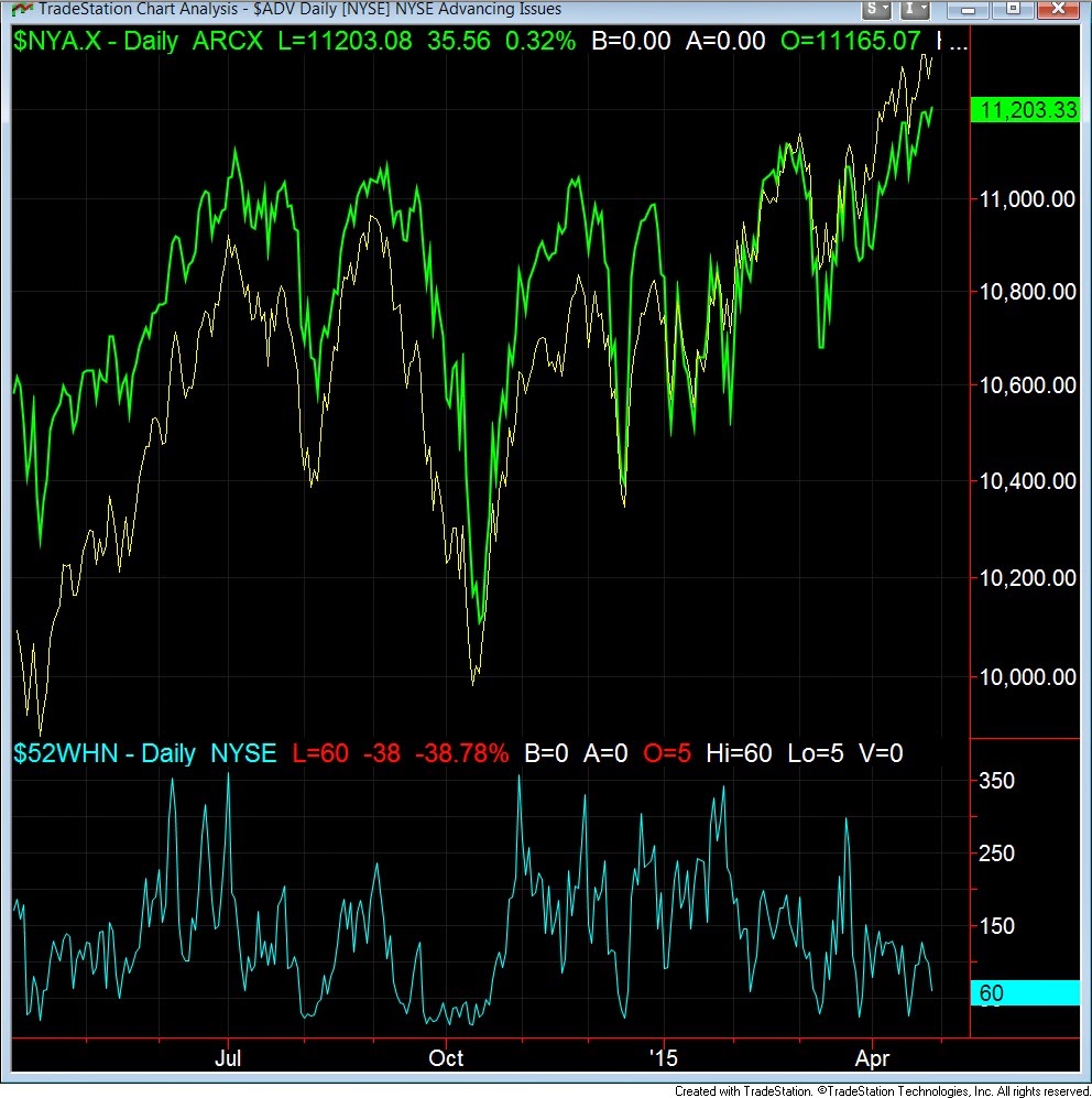
Meanwhile, US index's were laggards as they finished flat to slightly positive.  Digging deeper, strength was seen in smaller caps while growth outpaced value.


From a sector standpoint the winners vs. laggards was striking.  Strength was seen all quarter in healthcare while utilities were a constant drag.  The weakness in utilities continues the interest rate theme and shows how the threat of higher rates can impact the market.  Healthcare continues to benefit from the enormous rise in biotech valuations and activity.


From a macro asset class standpoint, the dollar stood out among all the winners.  Another interesting story was that given all the persistent worry about rising interest rates, bonds prices continued to hold firm as yields have fallen since year end.   If you guessed the biggest loser was the Euro considering the dollar strength you would be almost right.  It was the 2nd most significant loser we follow behind oil.   The ratio chart below comparing the dollar to oil shows a heck of a story.  Starting last summer these two asset classes have moved in near perfect opposition.


The emergence of Europe as a leader in Q1 was a direct correlation to the fresh round of quantitative easing they've recently embarked on.  Considering the US's history of QE and how it positively moved asset classes, this could have a prolonged affect on European risk assets.

Here's a look at where some of the more widely followed benchmarks and ETFs stood at quarter end.